
In this tutorial I will show you how easy it is to add a fully responsive navigation menu to your website, using HTML, CSS grid and a little JavaScript.
CSS grid is the new modern way to build responsive websites without having to use CSS library’s such as Bootstrap, Foundation, Materialize and more of the others.
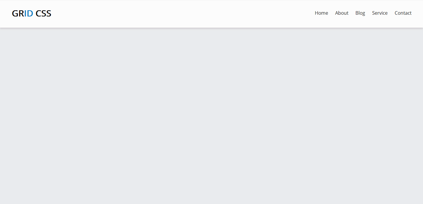
Here is an example of what we will be building in this tutorial. The desktop view of the navigation menu.
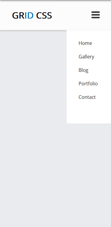
The mobile view of the navigation menu.
CSS Grid Nav-Bar
First we start with the HTML, within the body tags you’ll see the header and nav tags.
index.html<pre>
<!DOCTYPE html>
<html lang="en">
<head>
<meta charset="UTF-8">
<meta name="viewport" content="width=device-width, initial-scale=1.0">
<meta http-equiv="X-UA-Compatible" content="ie=edge">
<title>CSS Grid Navigation Bar</title>
</head>
<body>
<header>
<!-- Main Top Menu -->
<nav>
<div id="navbar">
<div id="logo">
<div class="logo">Gr<span>id</span> CSS</div>
</div>
<div id="links">
<a href="">Home</a>
<a href="">About</a>
<a href="">Blog</a>
<a href="">Service</a>
<a href="">Contact</a>
</div>
<div class="mobile-btn">
<a id="menu-btn" onclick="myFunction()" class="fa fa-bars fa-2x"></a>
</div>
</div>
</nav>
<!-- Mobile Menu -->
<div id="mobile-menu" class="mobile-menu">
<ul class="mobile-links">
<li class="nav-list"><a href="#">Home</a></li>
<li class="nav-list"><a href="#">Gallery</a></li>
<li class="nav-list"><a href="#">Blog</a></li>
<li class="nav-list"><a href="#">Portfolio</a></li>
<li class="nav-list"><a href="#">Contact</a></li>
</ul>
</div>
</header>
</body>
</html>
</pre>Few things going on here, we have a logo div followed by the menu links.
As you see there are two menu lists, main top menu and mobile menu. The mobile menu will only display at a smaller screen size.
There is also a div (mobile-btn) with a onclick javascript function that will trigger the mobile menu view when on smaller screens.
Next we’ll add the CCS file
styles.cssbody {
margin: 0;
background-color: #e9ebee;
}
#navbar {
display: grid;
min-height: 100px;
grid-auto-flow: column;
background-color: #fcfcfc;
grid-gap: 1.5em;
padding: 0 40px;
-webkit-box-shadow: -1px 4px 5px 0px rgba(209, 205, 209, 1);
-moz-box-shadow: -1px 4px 5px 0px rgba(209, 205, 209, 1);
box-shadow: -1px 4px 5px 0px rgba(209, 205, 209, 1);
}
#logo {
display: grid;
justify-content: start;
align-content: center;
font-family: "Open Sans", sans-serif;
font-size: 30px;
font-weight: 700;
color: #000;
text-transform: uppercase;
}
.logo span {
color: #0474bc;
}
#links {
display: grid;
justify-content: right;
align-content: center;
grid-auto-flow: column;
grid-gap: 1.5em;
font-family: "Open Sans", sans-serif;
}
a {
text-decoration: none;
color: #333;
}
a:hover {
color: #0474bc;
}
/* =======================
******* Mobile Menu ******
========================*/
.mobile-menu {
display: block;
list-style-type: none;
background-color: #fff;
float: right;
width: 150px;
padding: 5px 0 50px 0;
border: 1px solid #eee;
z-index: 55;
}
.mobile-links li {
line-height: 2.8rem;
}
.mobile-btn {
display: grid;
justify-content: right;
align-content: center;
grid-auto-flow: column;
cursor: pointer;
}
.nav-list {
font-family: "Open Sans", sans-serif;
list-style-type: none;
}
.nav-list:hover {
opacity: 0.5;
cursor: pointer;
}
/* Mobile to Tablet */
@media (min-width: 320px) and (max-width: 767px) {
#links,
.mobile-menu {
display: none;
}
}
/* Tablet to Desktop */
@media (min-width: 768px) {
.mobile-menu,
.mobile-btn,
.fa-bars {
display: none;
}
}
In the css file, we first set the body margin to 0px with our background color. Next we set the navbar and logo’s height, responsiveness and styles.
Furthermore, we add some media queries for a little more customization for smaller and larger screens.
Now finally we add the JavaScript function to open and close the navigation menu while on mobile size screens.
<code>custom.js</code>// Mobile Menu Toggle Button JavaScript
function myFunction() {
var x = document.getElementById("mobile-menu");
if (x.style.display === "none") {
x.style.display = "block";
} else {
x.style.display = "none";
}
}Our JavaScript toggle function, here we first set a variable x to the id of the mobile-menu and then checking if it’s not displaying on screen, to display otherwise don’t display.
Here is the same function using jQuery, in case you are using it.
// Mobile Menu Toggle Button jQuery
$("#menu-btn").click(function(){
        $(".mobile-menu").toggle();
    });
To get started using CSS grid and learn more about the fundamentals I would suggest this website you get more of a visual, drag and drop approach while also getting the code needed to use on your project.
To get all the source code for this tutorial please visit my codepen
Hope this helps you to build your next responsive navigation menu using CSS grid, and thanks for visiting the website.